GEO261
Bringing Fresh Design to the Geospatial Industry
In an industry locked by government contracts, heavy compliance procedures and military secrecy, fresh design breaks through.
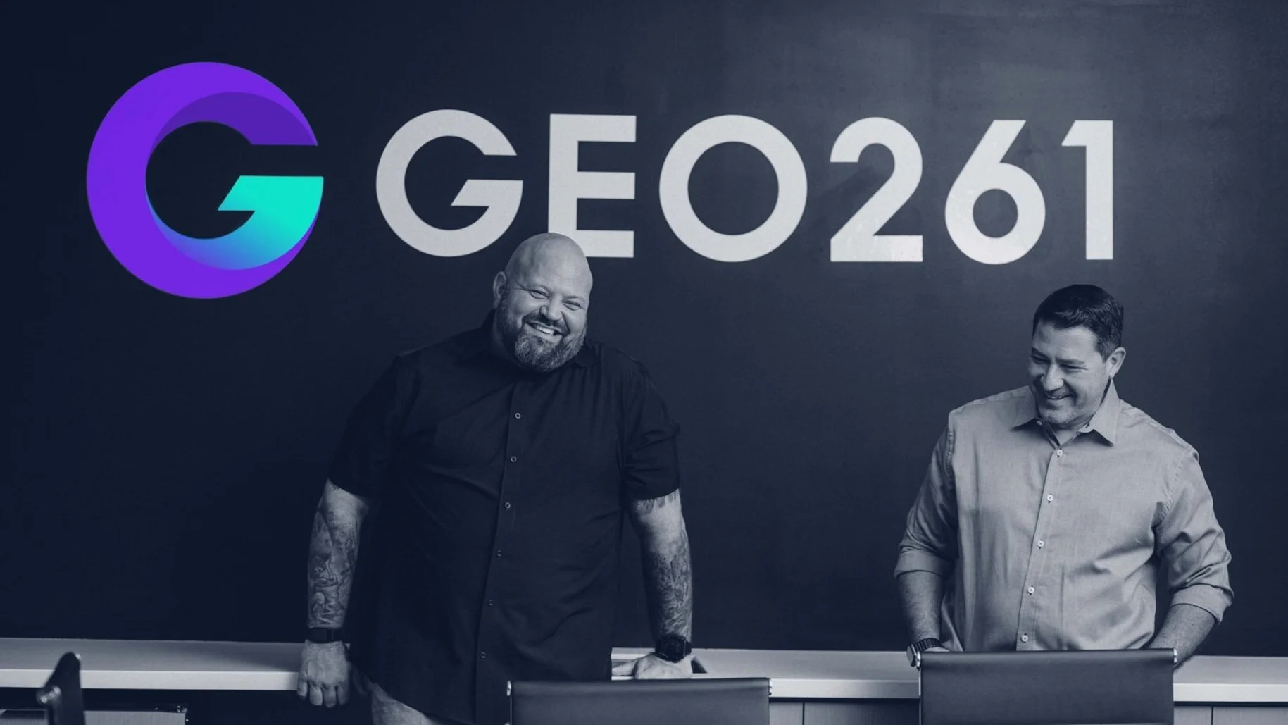
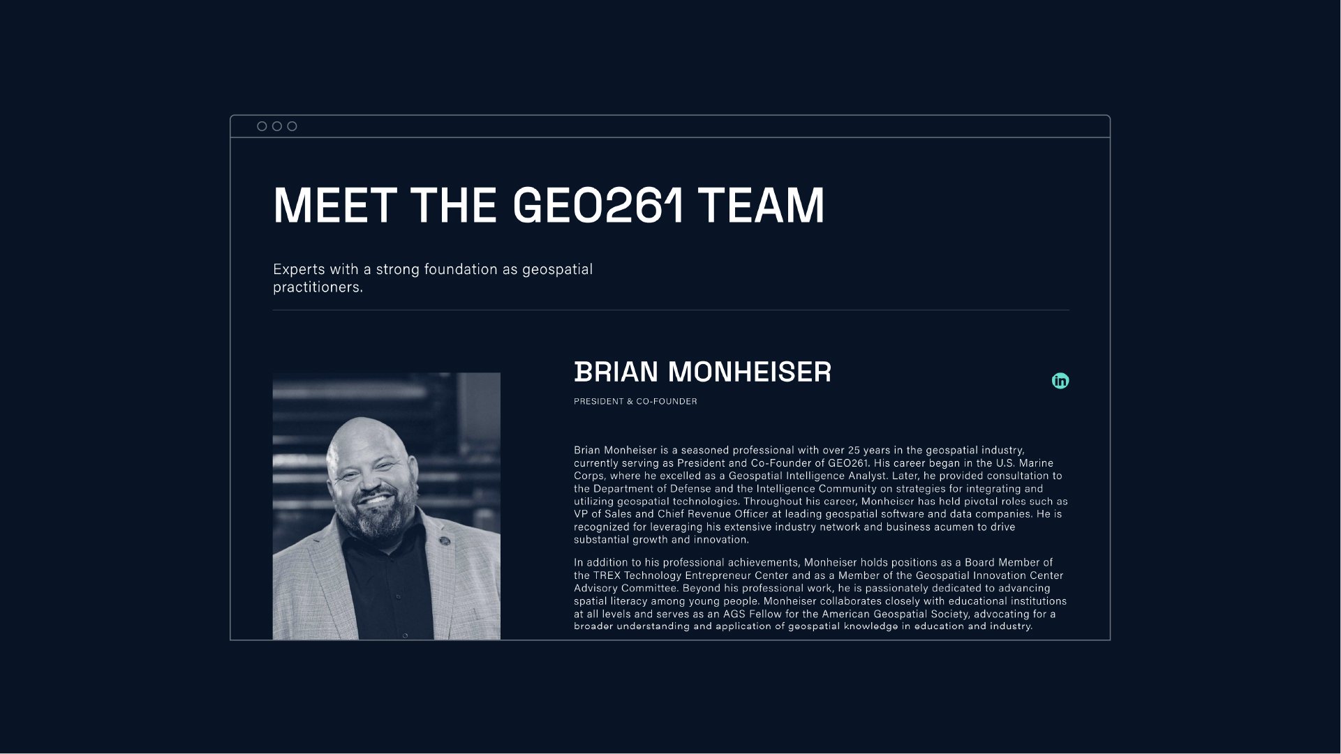
GEO261 is different. Our team met Brian Monheiser and Anthony Calamito three years ago in our old studio. The Downtown North identity was already stablished and we were working on the visual identity for The Post Building. At the time, Brian and Anthony were geospatial consultants hired by The Post to attract and retain potential tenants to the building. The pair, a dynamic duo made by a retired marine and a former intelligence official, impressed our team with their energy and magnetic camaraderie. They brought a world of knowledge, strong strategy chops, and unparalleled work ethic, paired with a disarming sense of humor.
GEO261 is all about empowering organizations to reach their growth potential. Through comprehensive assessments of strength and weaknesses, they aim to minimize risk, expand market share, and revenue; identify targets for merger or acquisitions, and enhance products and services. In a world full of apps relying on geo location, businesses now understand the importance of integrating spatial thinking into their day-to-day processes. Technology has advanced to the point where spatial thinking is almost ordinary. Geography and spatial thinking is driving a better understanding of our world, enabling businesses to connect with customers in ways they never thought possible. GEO261 understands and assists businesses and organizations leveraging geo location and the insights derived from it.
For their logo design we confronted a couple of initial challenges. The brand nomenclature had two components: the term “GEO” and the “0261” code. The “O” at the center had to play a double role both as a letter “O” and a zero numeral. This was an inherited name that stands for GEO Intelligence, since the the numeral code 0261 refers to the intelligence department in the US military. The solution was a customized type composition anchored with a perfect circle right at the center of the name. A sense of precision and geometry honors the art of cartography, while parallel angles were introduced for dynamism and forwardness.
The icon, a bold, upper-case “G” that stands for geo, and growth, was built to evoke a circular arrow that goes inward to propel forward. A powerful metaphor representing growth as the process of understanding the inner turmoil of a client, while redefining a product or service for their markets, from where growth takes place.
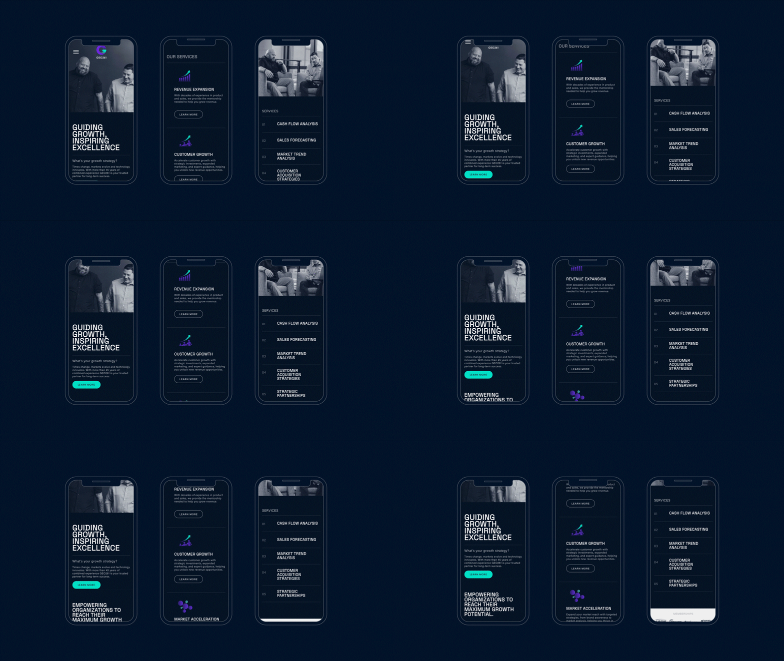
The use of a black and white aesthetic with just two accent colors was selected as a limited palette. The decision merges the austerity of government agencies with a punch of energy from the startup world. A minimalistic approach to typography followed, combining two type families, DM Sans with a clear, straightforward feel for main body copy and a slightly condensed, Space Grotesk for titles.
For a couple of months we kept weekly meetings to hone their message and get to their differentiation in the market place. It turned out that the key of their success was at the core of their friendship and complementary personalities, balancing the analytical and the relatable. We were inspired by their desire to open the geospatial world to young entrepreneurs, facilitating access to the government contracts for small businesses, and leveraging relationships to build a geospatial community at The Post Building. We gained two new friends, and neighbors in the process, since they decided to set up shop at The Post along with Block Inc., CashApp and CARTEL.
Afterall, brotherhood is a powerful thing.


