Mountain House Cafe
A visual identity for a dad’s cafe with a passion for the outdoors

Revealing the Brand Identity of Mountain House Cafe in St. Louis
For the branding of his soon-to-open cafe, John Monshausen chose CARTEL as his partner. In our initial discussion, he introduced us to a small brick building located at the intersection of Odell St. and Macklind Ave. in the Southwest Gardens neighborhood of St. Louis, Missouri. He pictured this becoming a lively cafe for the neighborhood's growing number of young families, as well as a cozy spot for his own family and friends to come together.
Creating a Narrative: The Essence of Mountainhouse
During the discovery phase of the project we learned that John loves to travel and spend time in the great outdoors. He mentioned one of his fondest memories was drinking a warm cup of coffee on a cold morning in the mountains of Costa Rica. However, it became quickly evident that he was creating this cafe for his four children. He saw this cafe as an opportunity to relive old family memories and create new ones as well. He also told us the name of the cafe would be Mountainhouse, which is the direct translation of his German last name Monshausen. From that point we made the decision that John’s identity as a family man with a love for the outdoors would become the driving ethos of this new cafe.
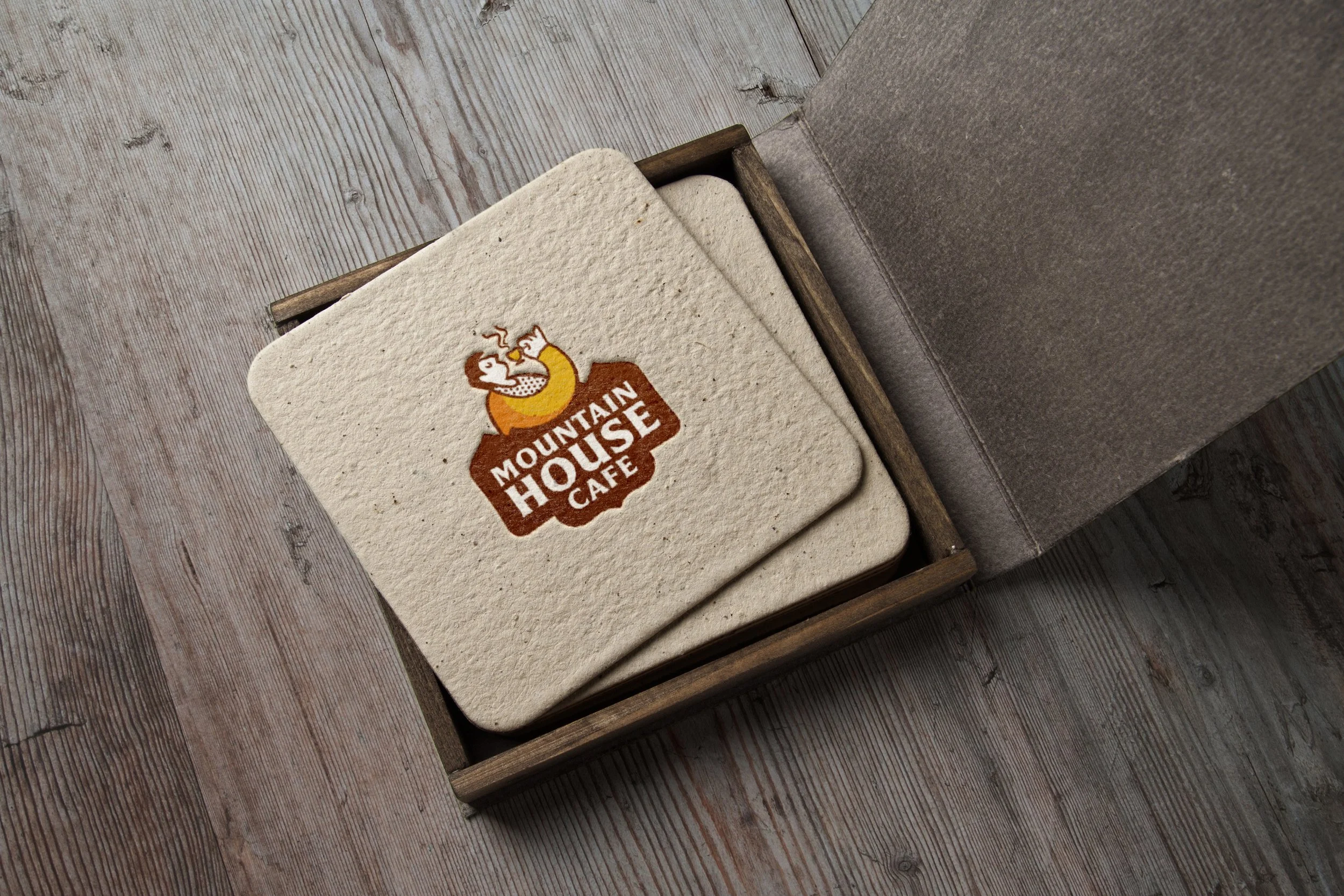
Designing the Logo: Symbols for John and The Outdoors
Our final logo presents an illustrative depiction of John himself grasping a mug of coffee. The illustration style is meant to bring a sense of joy and reflect John’s jovial and welcoming spirit. The custom lettering was inspired by the stable serif structures of Friz Quadrata and Alverata. The typographic lockup breaks the full name into two words, “Mountain House” strategically placing greater emphasis on “House.” It is all placed into a unique containing shape which is a nod to national park signage. We also developed an entire color palette inspired by striking colors of National Park Posters, specifically the ones commissioned by the Works Progress Administration (WPA) in the 1930s and 40s.
Expanding the Identity: From Stickers to Web Presence
Once the logo was decided, phase two of the project consisted of print collateral and website design. Outside of the cafe is a bright orange pillar that is covered in stickers, stuck on by previous tenants and passersby. John loved the idea of keeping this going with Mountain House Cafe stickers. Meant to be given out for free to customers, we created a series of stickers influenced by the memorabilia sold in national park stores in the 70s, with the thick bands of warm brand color and playful typographic catchphrases.
Cafe websites are incredibly important for quickly relaying information to the customer, which is why we designed the Mountain House Cafe to be simple and straightforward. The hours, location, and menu are accessible with a simple initial scroll, allowing users to have the necessary information within seconds of logging onto the site. All colors on the website are earthy and warm, the cream and brown colors evoking the senses, alluding to a warm latte. John’s love of nature can be found in the green and yellows of the website, as well as the photos of plants bringing life throughout the cafe.
Reflecting on Our Work with Mountainhouse Cafe
Our work with Mountainhouse Cafe has been a fun collaboration, blending our love for cafe branding with John's background and personality. It stands as a testament to what can be achieved through a collaborative, thoughtful process with a client. Explore more projects on our website to learn about our visual approach, or get in touch to discuss how we can help bring your vision to life.